Evolving a Canadian staple with clarity, confidence, and a sharper point of view.
When Sobeys came to us for what was initially scoped as packaging updates, the conversation quickly evolved into something bigger. The team saw an opportunity to refine the brand itself.
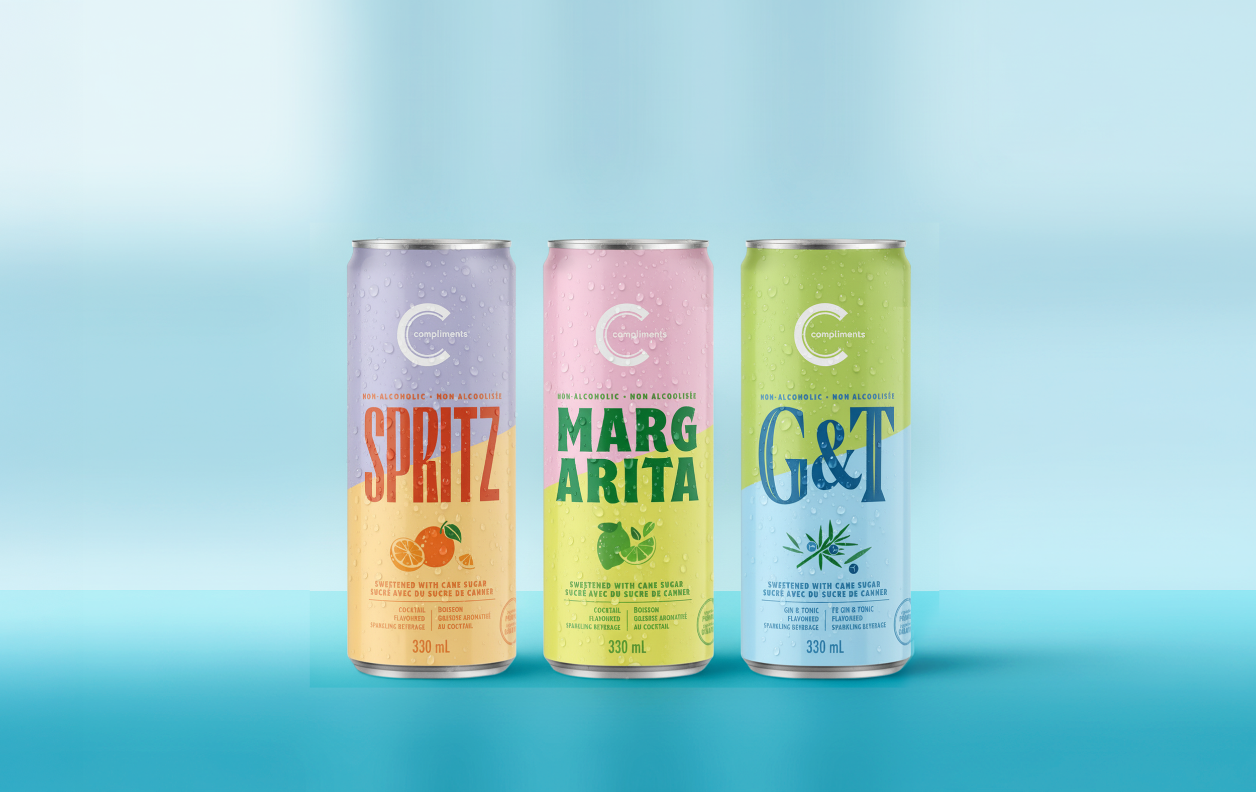
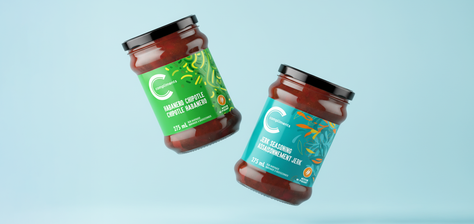
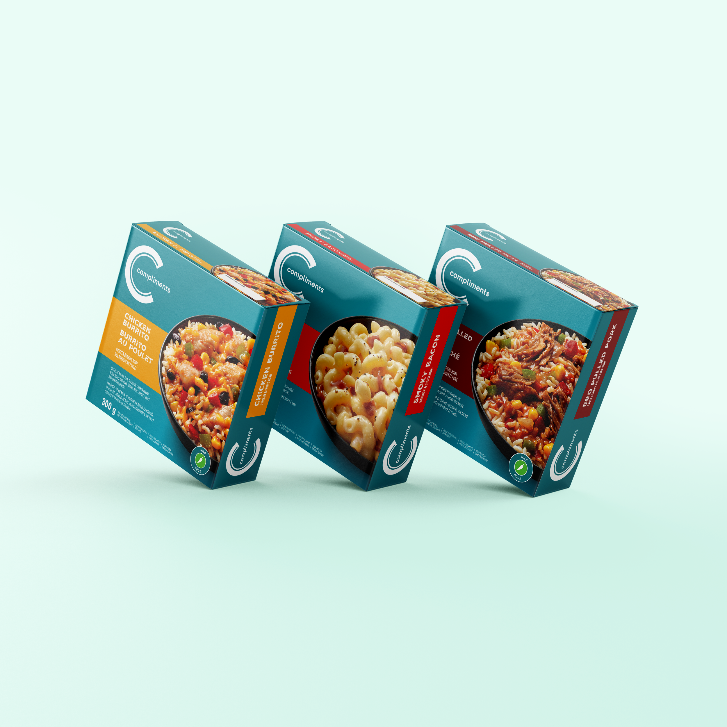
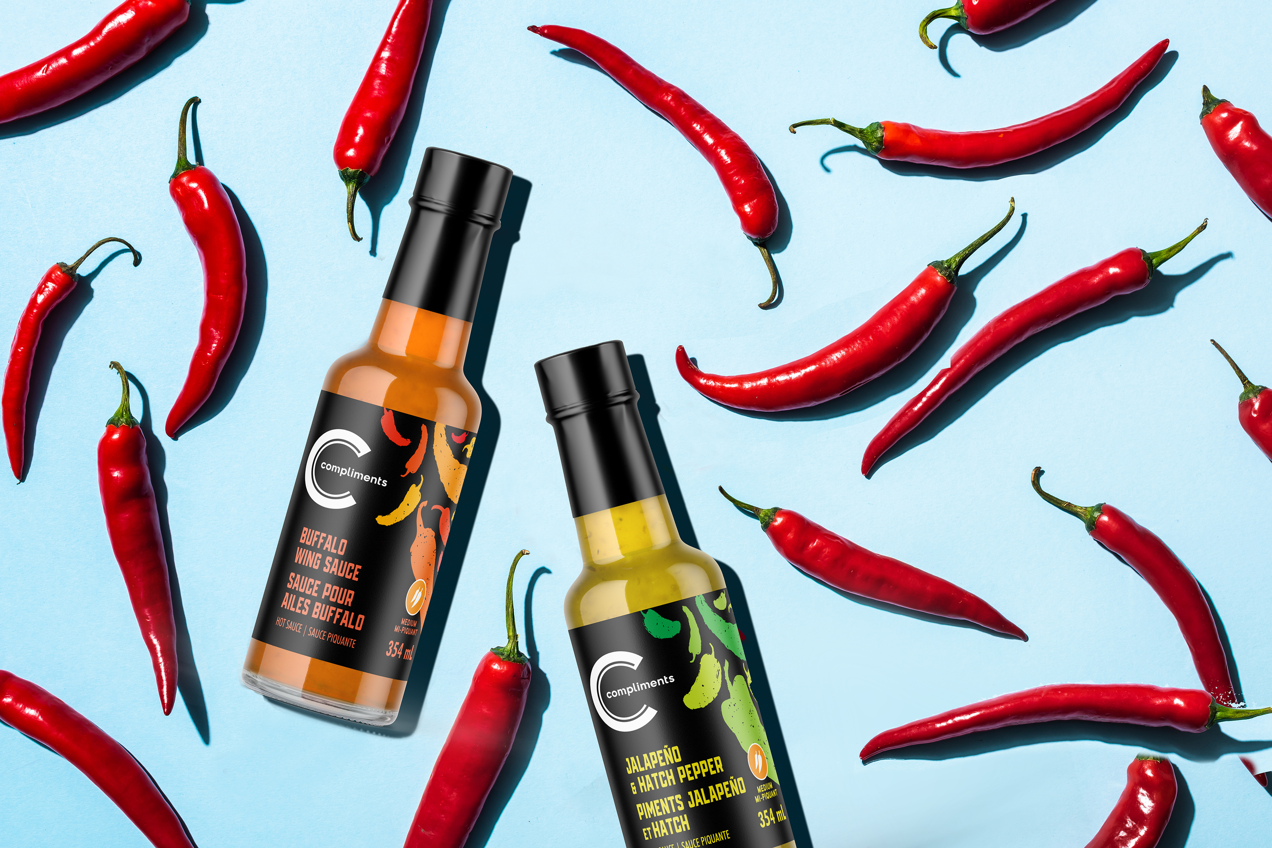
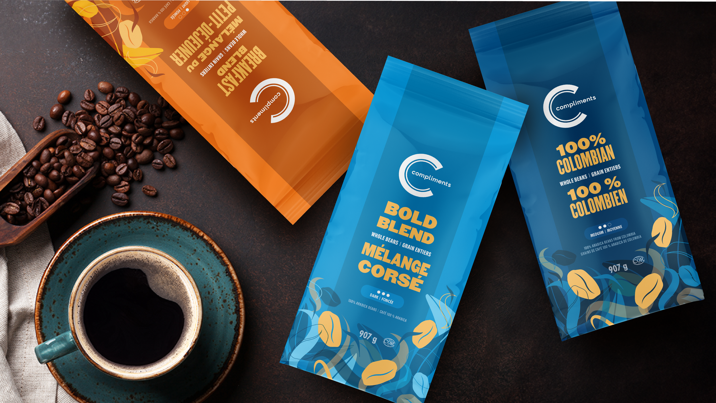
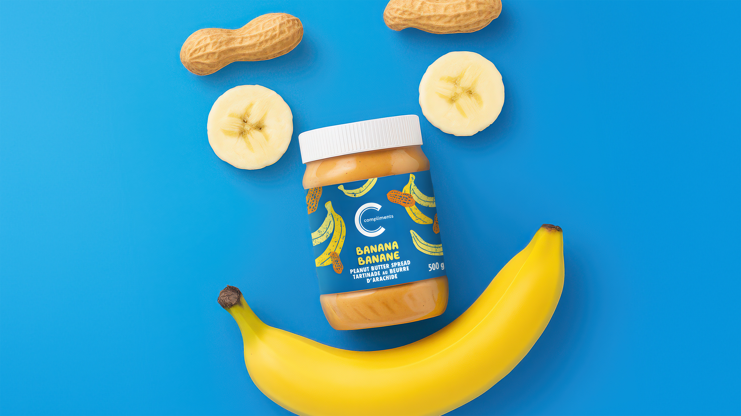
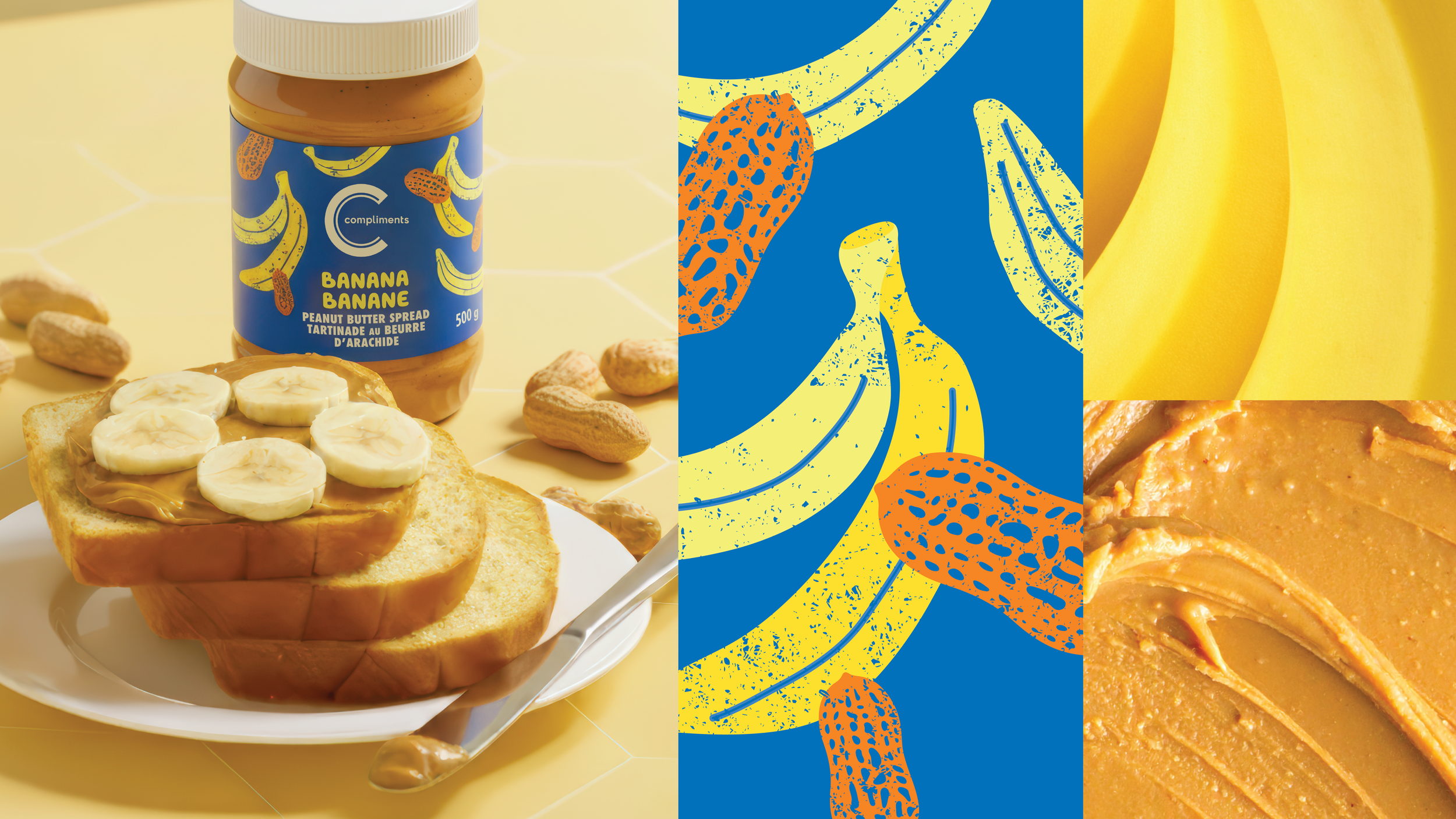
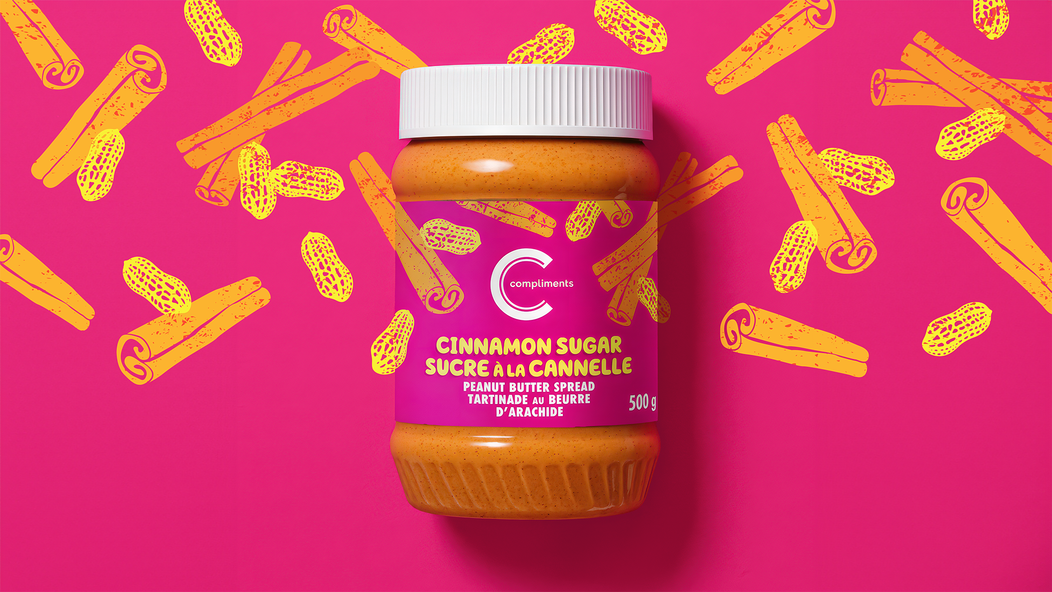
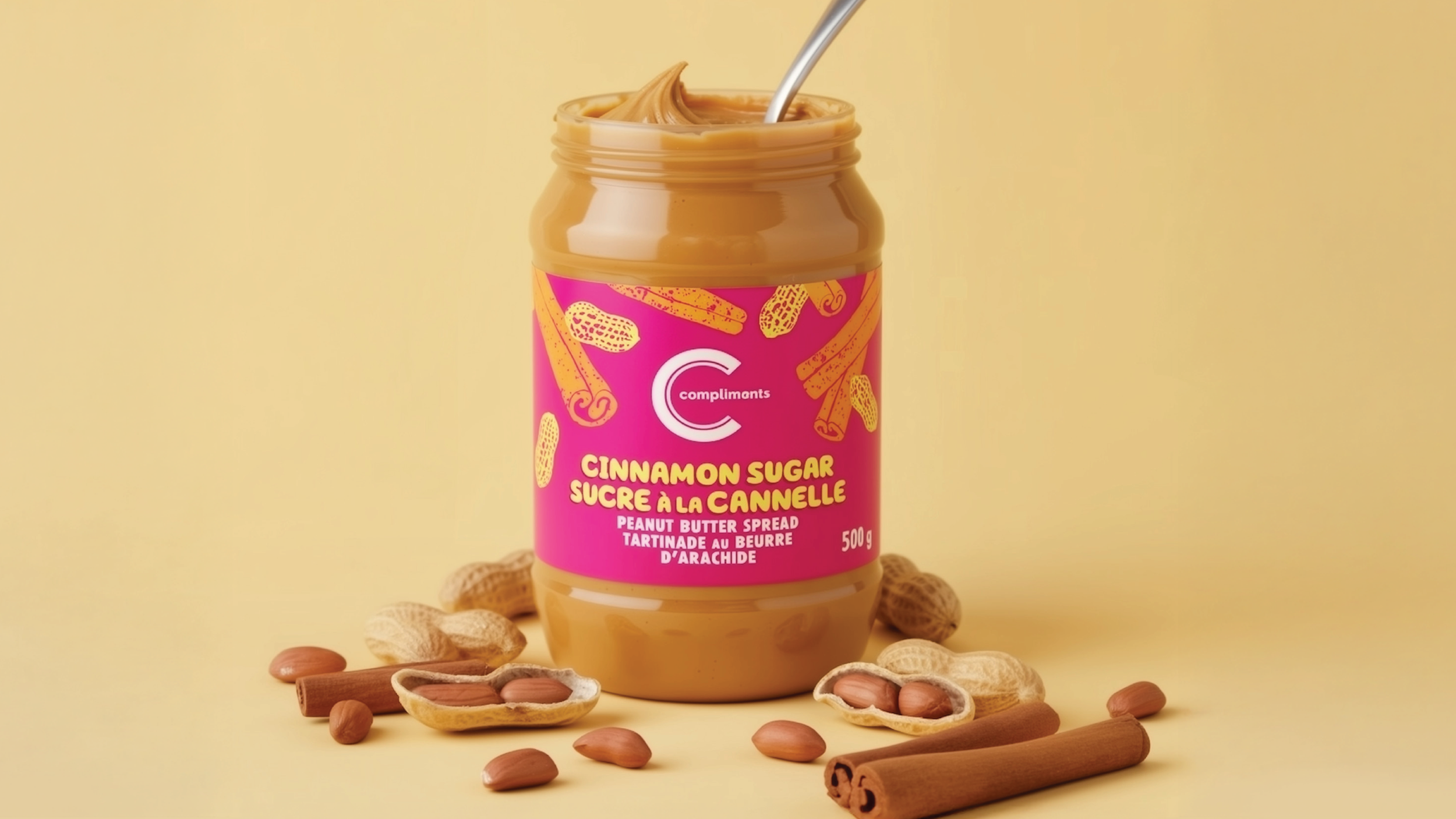
Compliments was already known for its bold colour blocking and iconic supergraphic logo, but shelf legibility was becoming a challenge, and the broader design system was ready for a thoughtful evolution. We revisited the system with fresh eyes, fine-tuning and modernizing the colour palette and typography, elevating the photography, and leaning into category-specific cues to create stronger relevance at shelf.
The result was a refreshed expression that felt clearer, more contemporary, and more engaging, while remaining unmistakably Compliments.
Compliments:
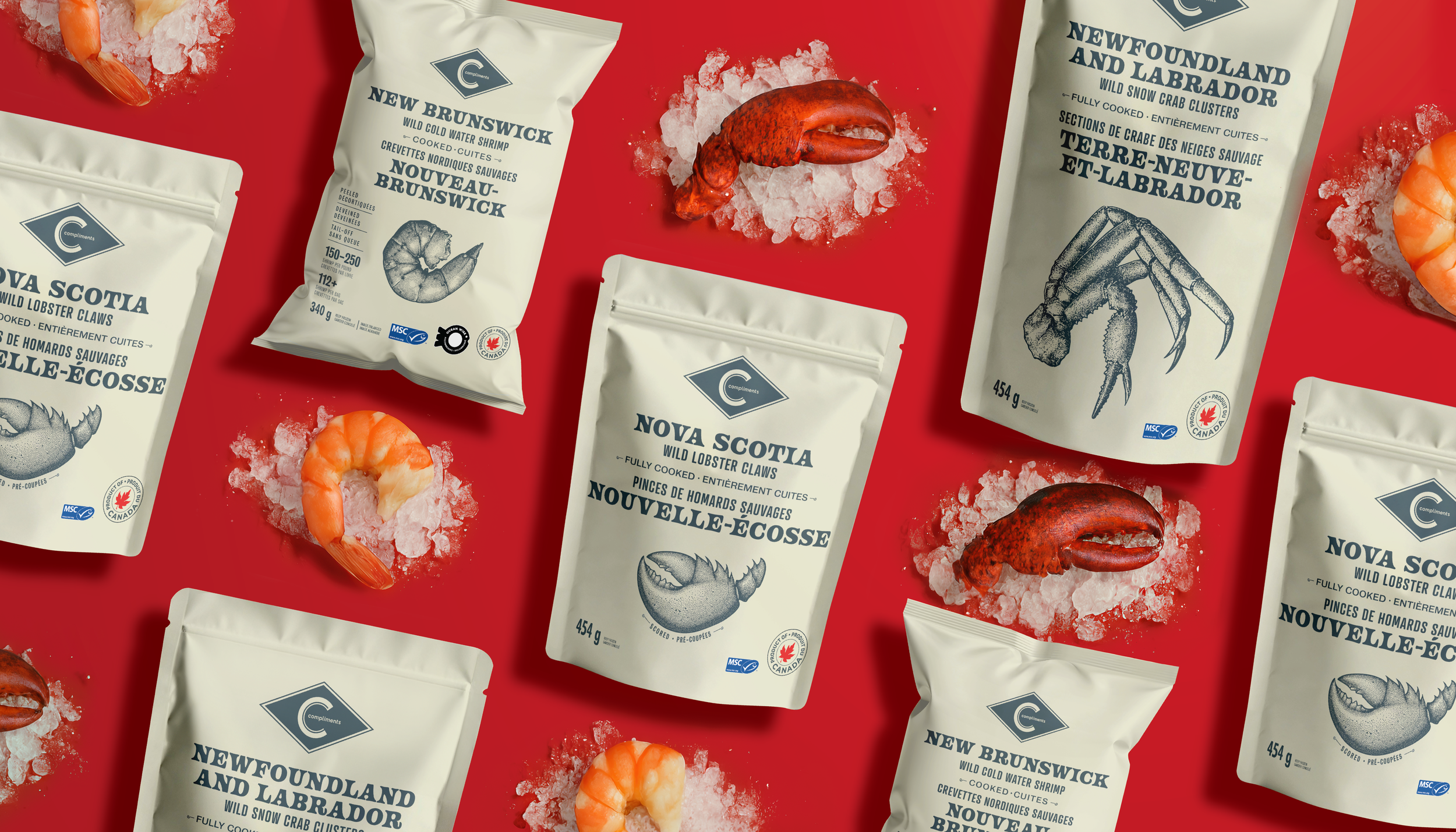
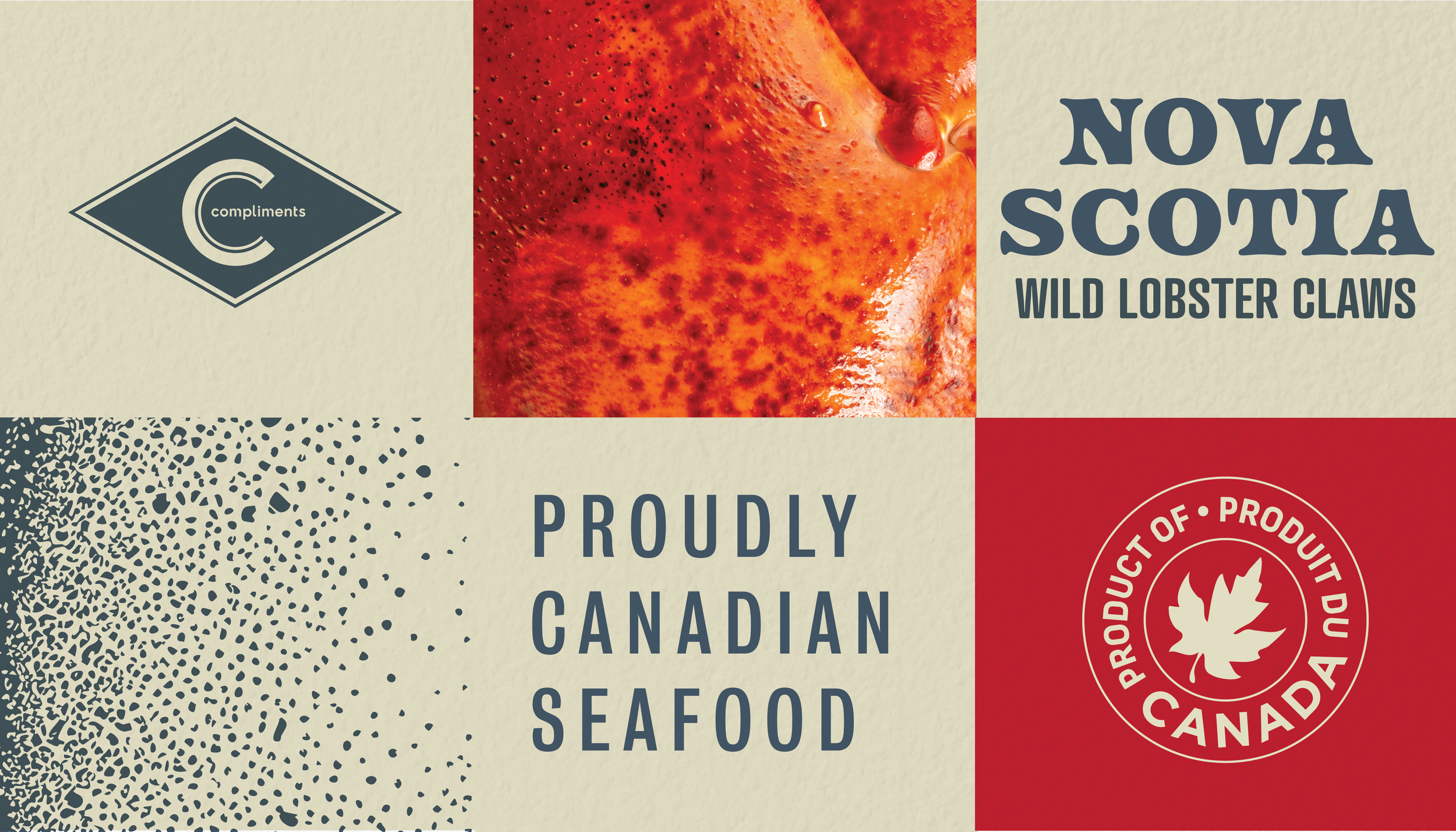
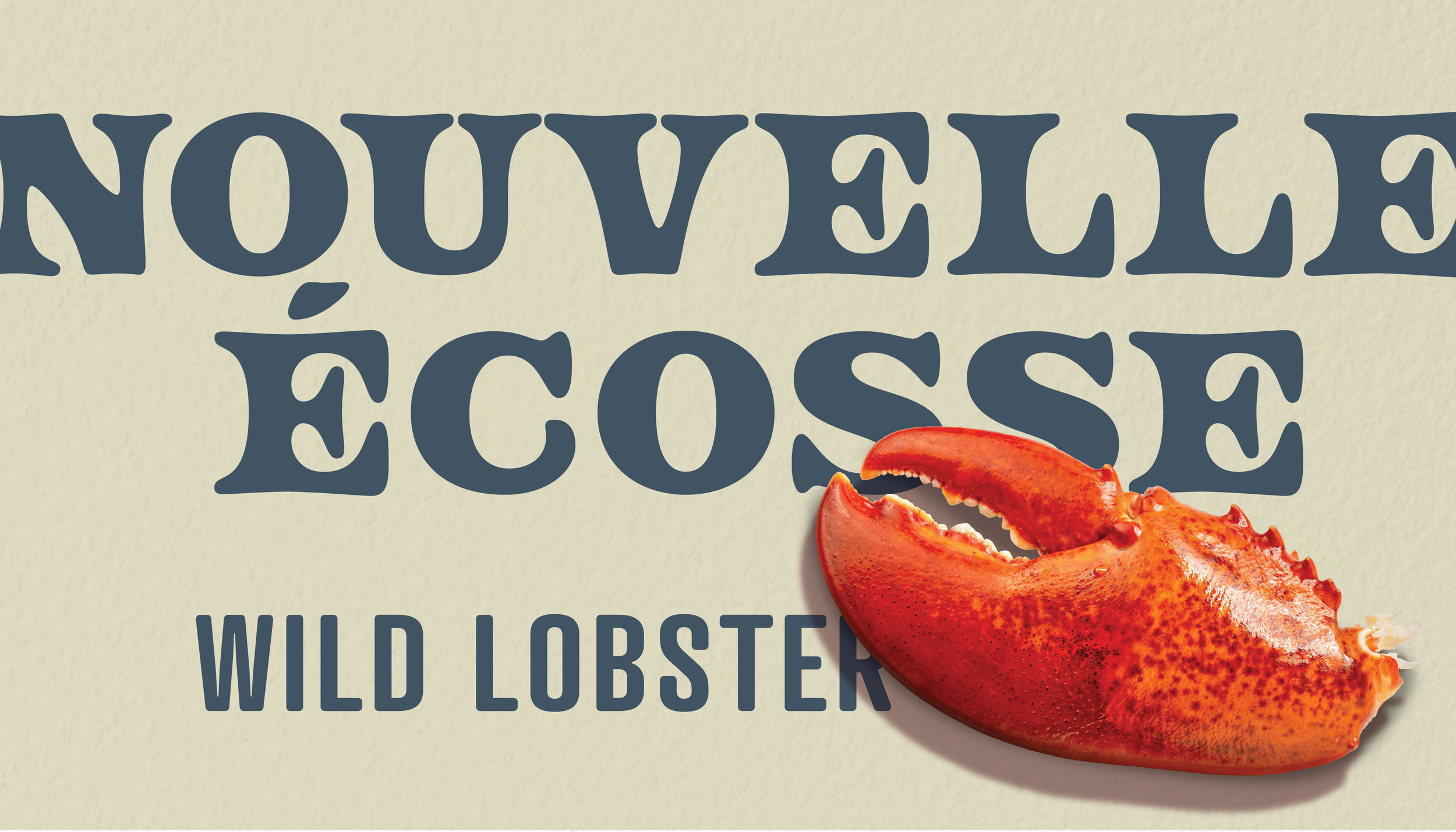
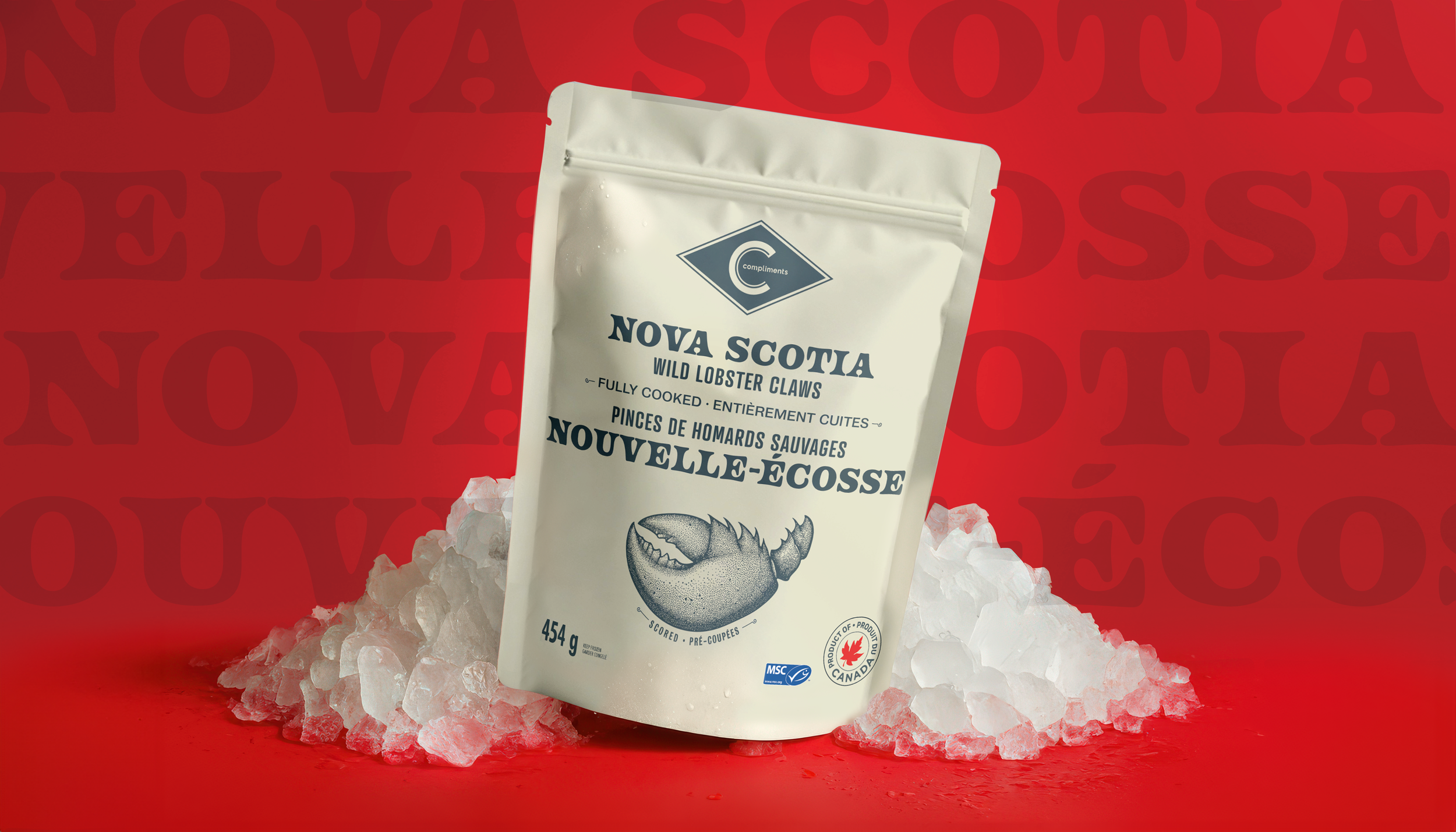
Land & Sea
For Sobeys and the Compliments brand, we set out to create a distinctly Canadian expression rooted in single-origin products from across the country. The goal was to celebrate where these products come from in a way that felt thoughtful and elevated, but still approachable.
In a category that often leans heavily into maple leaves and flag-waving, we took a quieter route. Clean layouts, plenty of breathing room, and vintage-inspired illustration spotlight each province of origin without overdoing it. A subtle kraft-style backdrop and strong serif typography bring in a sense of heritage and craft, while keeping the overall feel fresh and current. We even wove in light nods to Sobeys’ archival design, adding depth without slipping into nostalgia.

Big 8
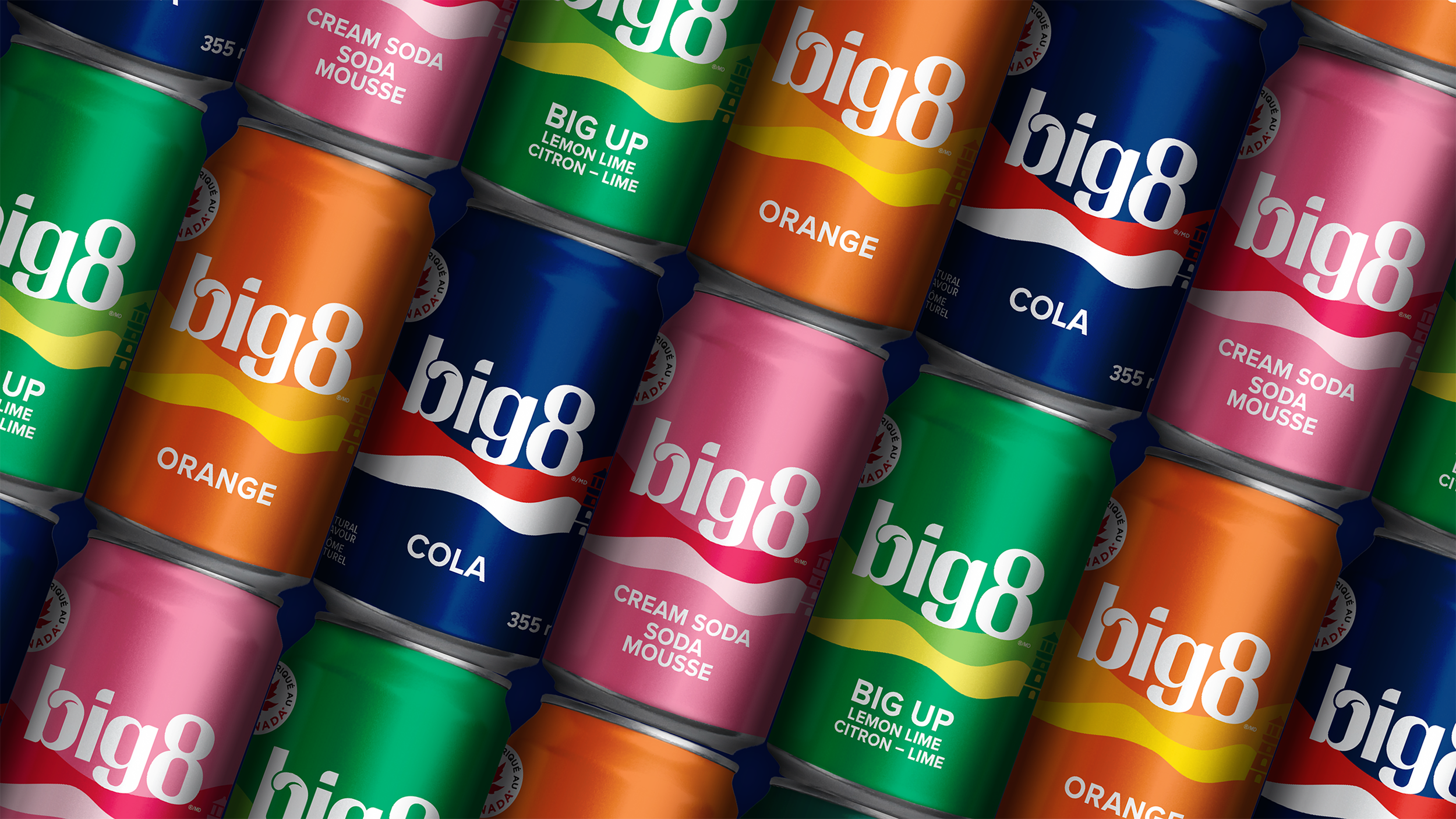
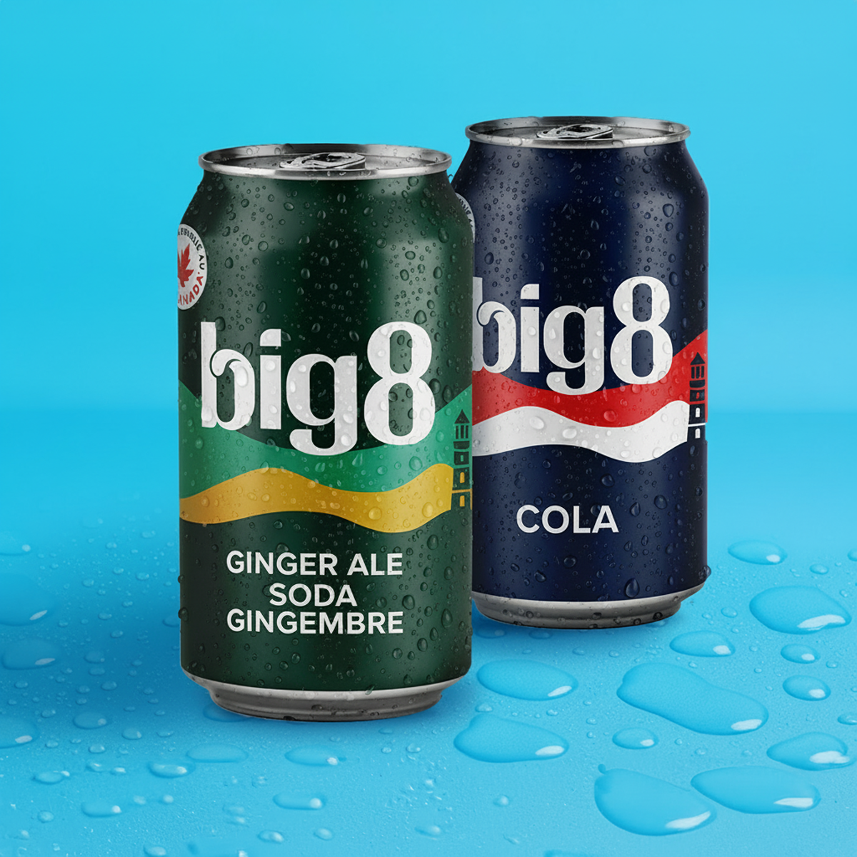
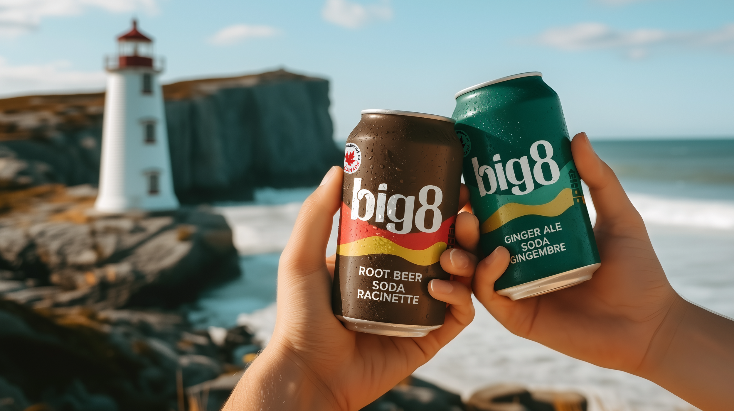
Big 8 is an Atlantic Canadian icon, but it was ready to feel as good as it tasted. The opportunity was to modernize the brand for today’s beverage aisle while keeping the loyalty and pride that made it a staple in the first place.
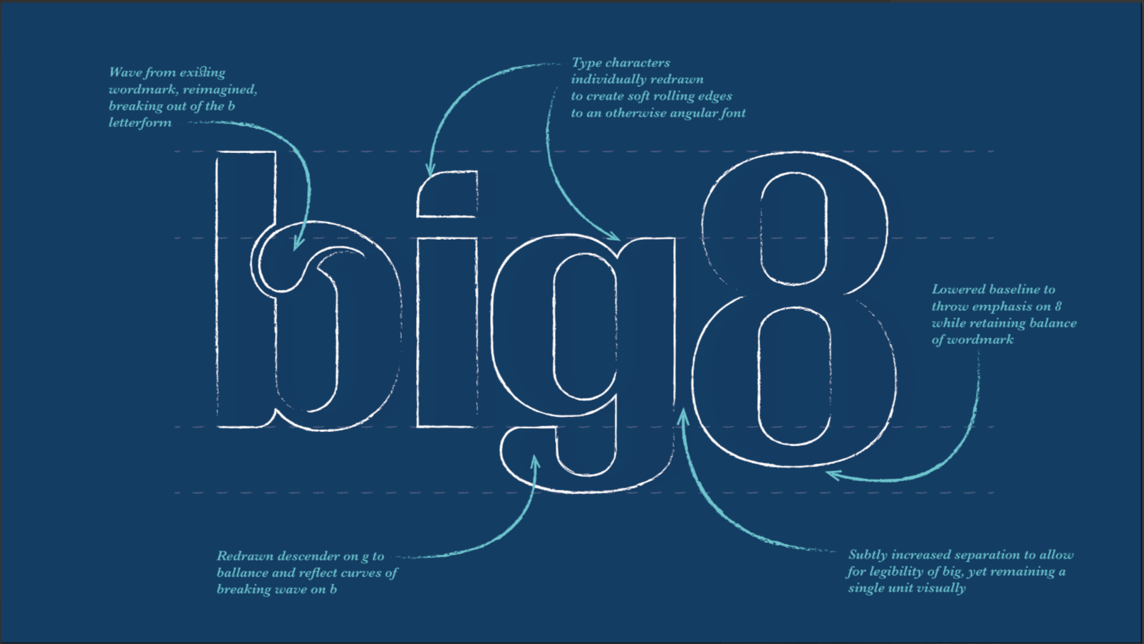
This was a meaningful overhaul, but one grounded in respect for what people already loved. We refined the wave logo for clarity and balance, then built a bold, cohesive system inspired by Atlantic coastlines. Strong colour blocking makes flavours easy to navigate, while subtle regional cues keep the storytelling rooted in place. Cleaner type and simplified layouts lifted perception across the full range.
The result feels fresh but familiar. Confident on shelf, proud of its roots, and proof that local heritage can absolutely show up in a modern way.