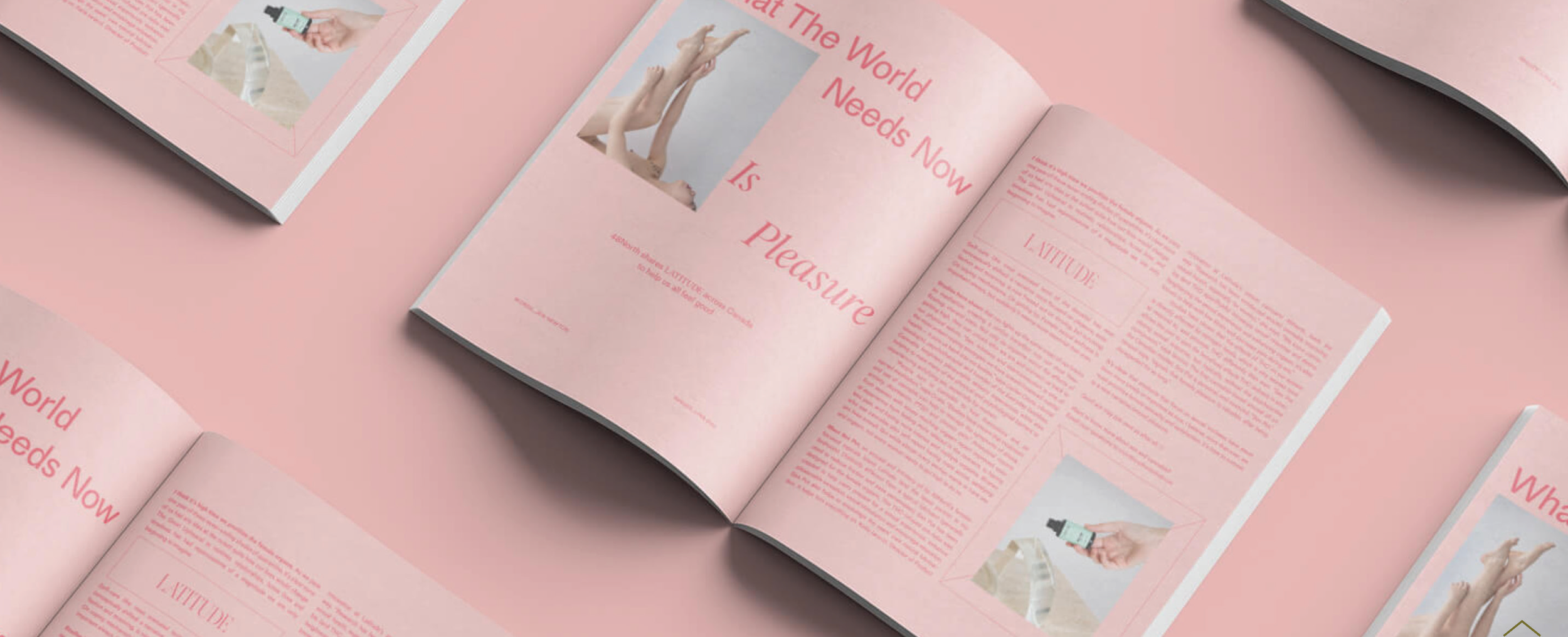
Designing a cannabis brand that feels more like culture than commodity.
Born from its editorial namesake, Latitude was never about chasing “the high.” It was about living at a higher frequency. Thoughtful, design-forward, and grounded in culture.
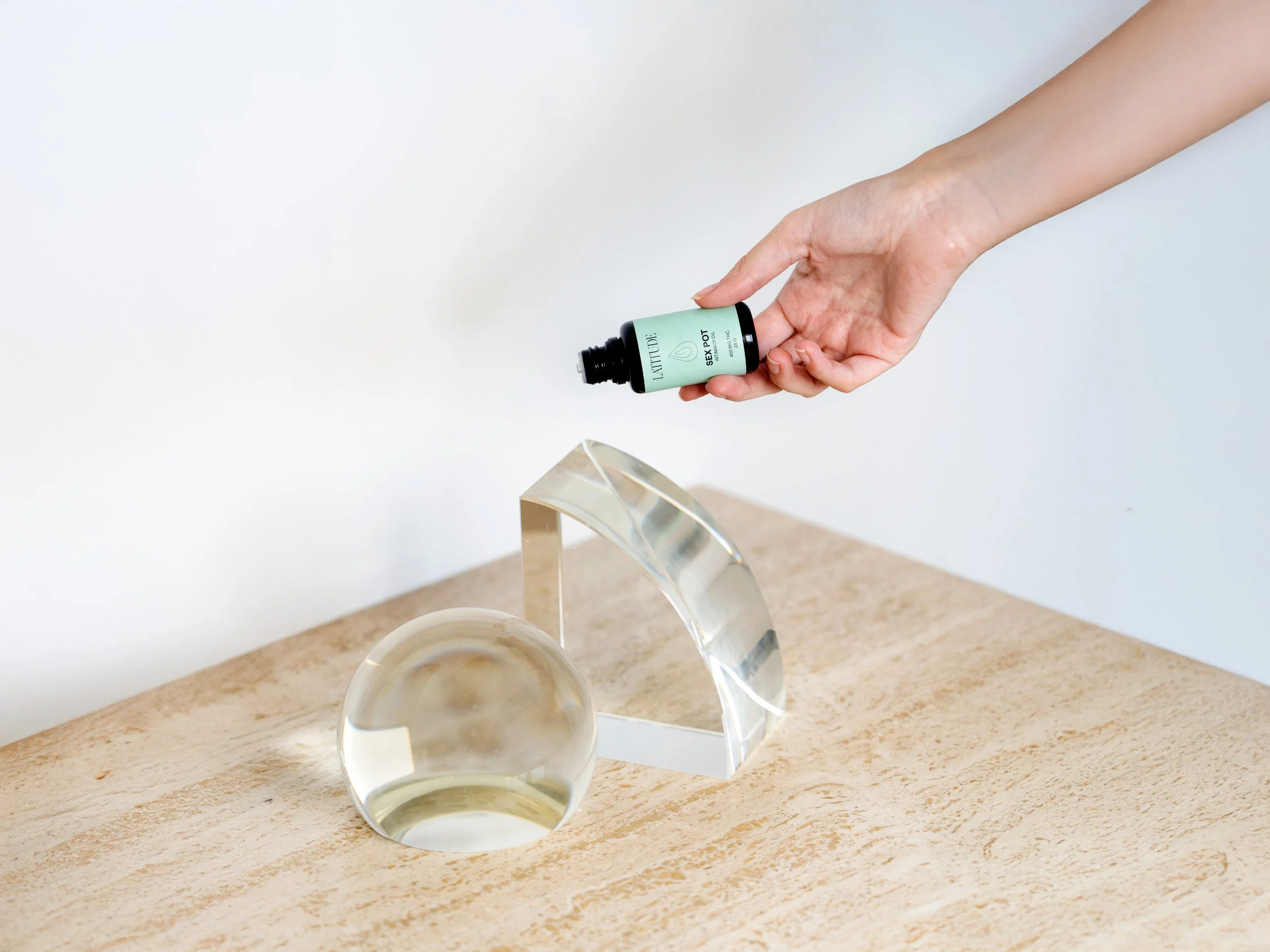
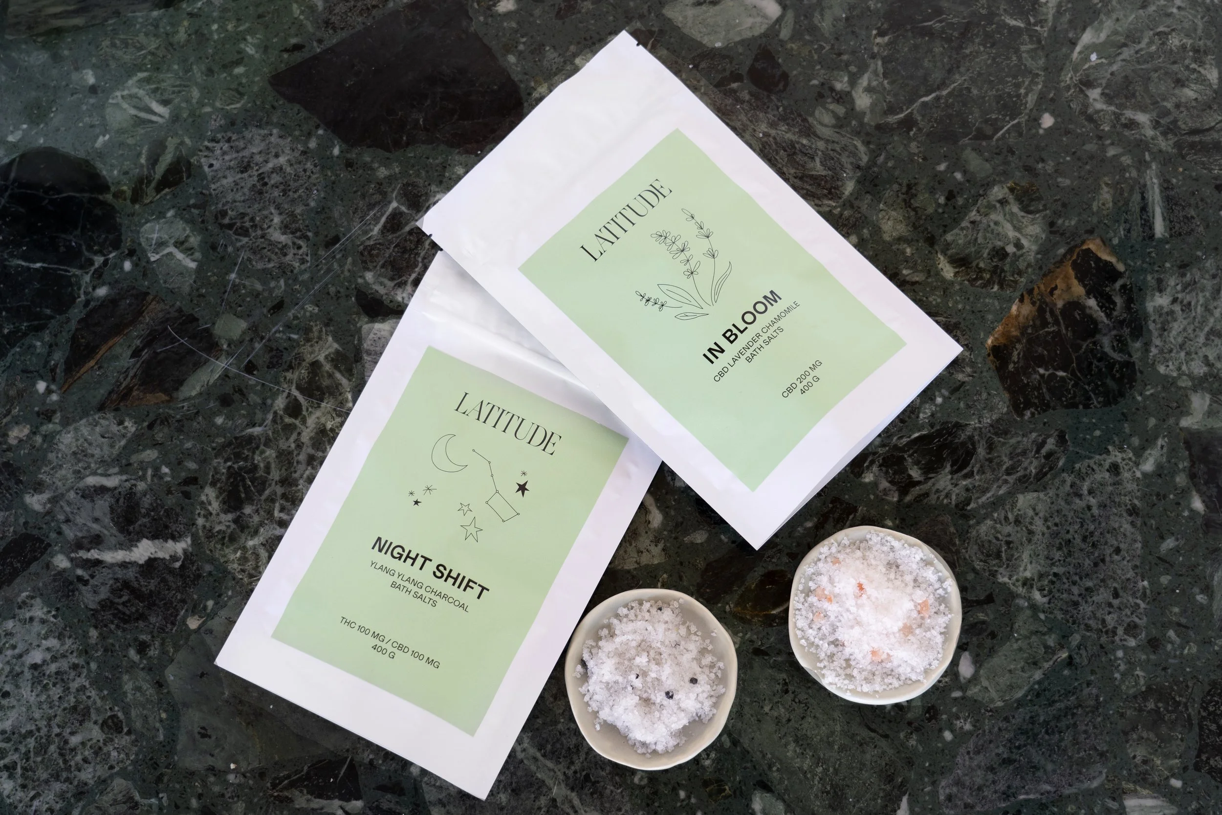
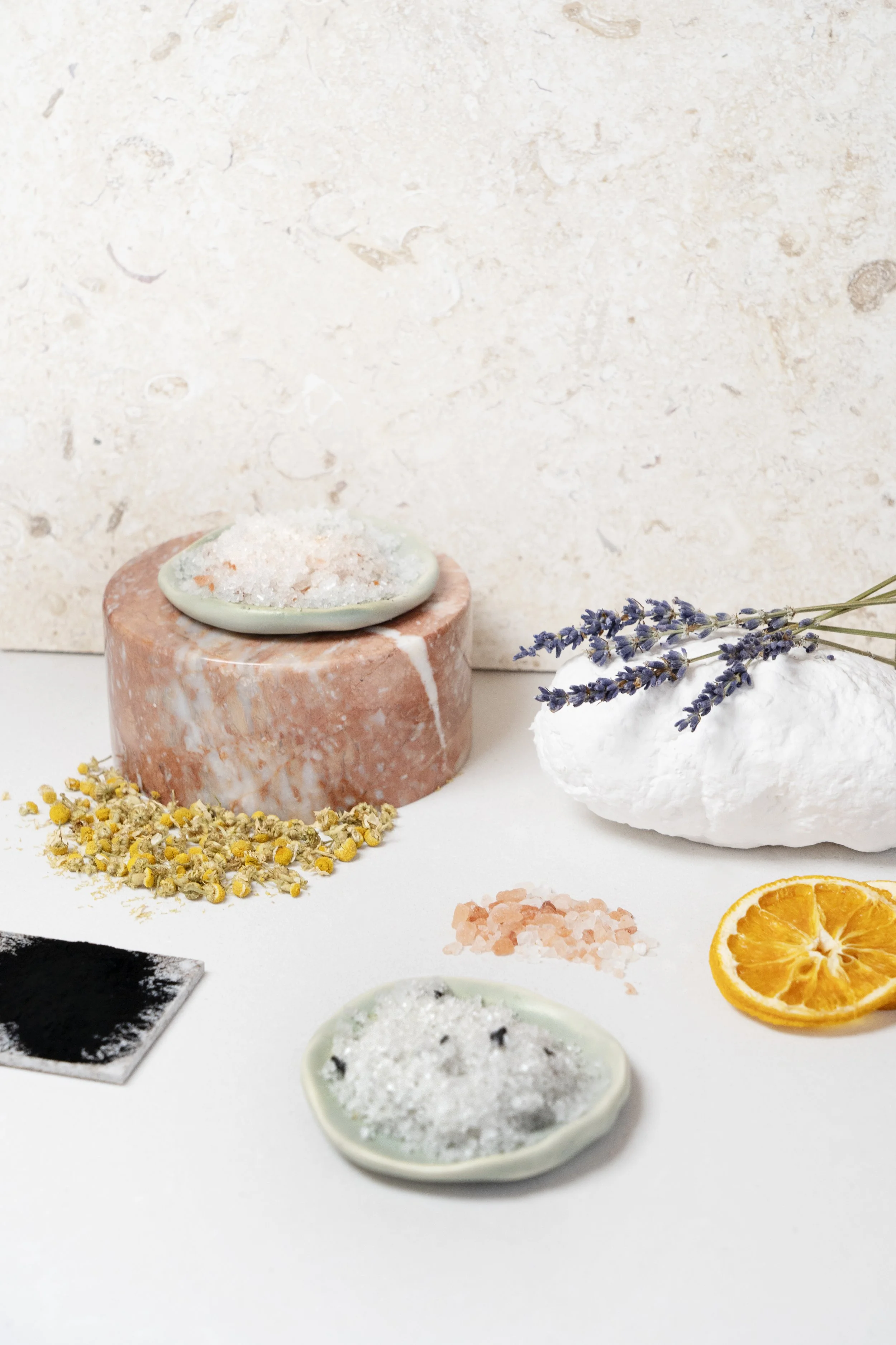
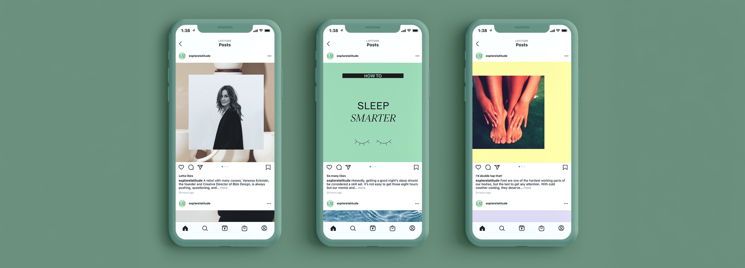
The product and visual identity drew directly from the ultra-editorial roots of the magazine. Clean, confident typography paired with a bright, almost unexpected colour palette created a striking contrast.
Latitude was built to feel considered and contemporary. A cannabis brand that feels more like a magazine on your shelf than a product in your stash.